Work with Task Templates
Task Templates let Admins create standardized formats for approval and document review tasks that developers use in Human-in-the-Loop and Reject/Repair workflow steps. Without templates, every workflow would need its own custom task configuration, leading to inconsistency and duplicated effort. Templates are versioned automatically, can be exported and imported as JSON, and ensure consistent task handling across all your workflows.
Templates let you create predefined task formats that workflows can reuse. They come into play in steps such as Human-in-the-Loop (HITL) and Reject/Repair (RR), where a person needs to approve a request or review a document before the workflow moves on. Instead of rebuilding the same approval screen for every process, you design it once as a template and point any number of workflows at it — which keeps approvals and reviews consistent across the platform.
You can design a template for two main purposes:
- Approval: For tasks where an approver needs to review and approve or reject.
- Document Review: For tasks where a reviewer verifies the extracted text from documents and makes the changes if required.
A user with an Admin role must create templates in AEUI for developers to use in Human-in-the-Loop (HIL) or Reject and Repair (RR) steps. A template can either include both Data Fields JSON and Action Buttons configuration (for Approval tasks) or only Action Buttons configuration (for Document Review tasks). In a Human-in-the-Loop step, approvals are handled through action buttons. When an approver selects an action button, the workflow continues according to the selected action.
In addition to creating templates from scratch, you can also import existing templates. This helps save time and ensures consistency when setting up tasks across multiple workflows.
View Task Templates
The Task Templates page is your starting point for everything related to template. From here you can see what's already live, pick up drafts you haven't finished, and open any template to edit, delete, or export it.
To view Task Templates page details:
-
In the menu, click Tasks → Templates. The Task Templates page appears.
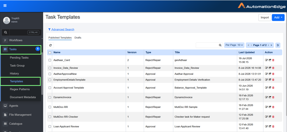
Task Templates page
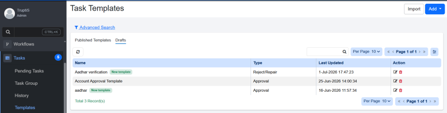
Task Template → Draft
-
The page is split into Published Templates (live and available to workflows) and Drafts (still in progress and not yet visible to business users). View Task Templates:
Field name Description Published Templates Name Displays the unique task template name. Version Displays version of the task. For more details, see Version. Type Displays the task type. This shows as Approval when the Approval template is selected or Reject/Repair when the Document Review template is selected. Title Displays the default title specified in the template, which can be overridden by the plugin filed Task Title. For more details, check Human in Loop step in AutomationEdge Standard Plugin guide. Last Updated Displays Date and time when the task was last updates Action Click Edit  , Delete
  or export
  to manage the task. For more details, see Action.
Drafts Name Displays the unique name of the draft template. Type Displays the task type of draft. This shows as Approval when the Approval template is selected or Reject/Repair when the Document Review template is selected. Last Updated Displays Date and time when the task was last updates. Action Click Edit or Delete to manage the task. For more details, see Action.
Version
When you create a Task Template, it is assigned the default version number 1. You can then use the template to create tasks. Each task created refers to the template as its source.
If you modify and save the template later, the version number is incremented (for example, from version 1 to version 2), because the template has already been used to create tasks.
Action
-
Edit Click
to open the task template in edit mode. This allows you to update the template details such as Data Fields, Action buttons and other configurations. After making changes, save the template to apply the updates. -
Delete Click
to delete the template. A confirmation dialog appears asking you to confirm the deletion. -
Export Click
to export the template in JSON format.
Add Task Templates
Every template is built around a purpose, so the first thing you choose is its type. That choice shapes the rest of the experience: an Approval template gives you a full Form Builder for the approver's screen, while a Document Review template focuses on the actions a reviewer can take on an extracted document.
The next two sections walk through each type:
Add Approval templates
Use an Approval template whenever a person needs to look at a request and decide — approve an expense, sign off on a purchase order, green-light a new vendor. You'll design exactly what that person sees.
To add approval templates:
-
On the Task Template page, click Add. A list of task template types appears.
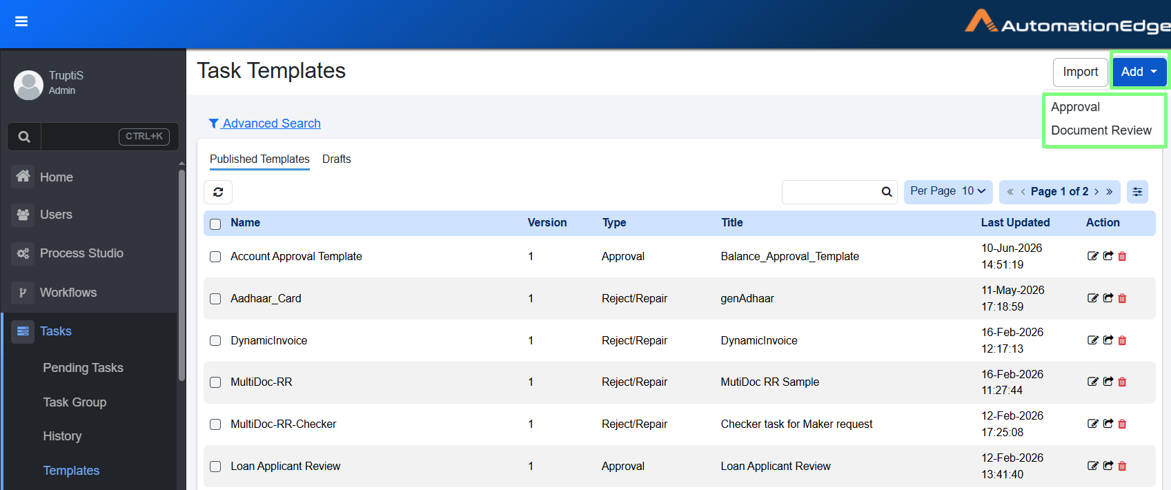
Task Templates page
-
In the list, select Approval. The Task Templates details appear.
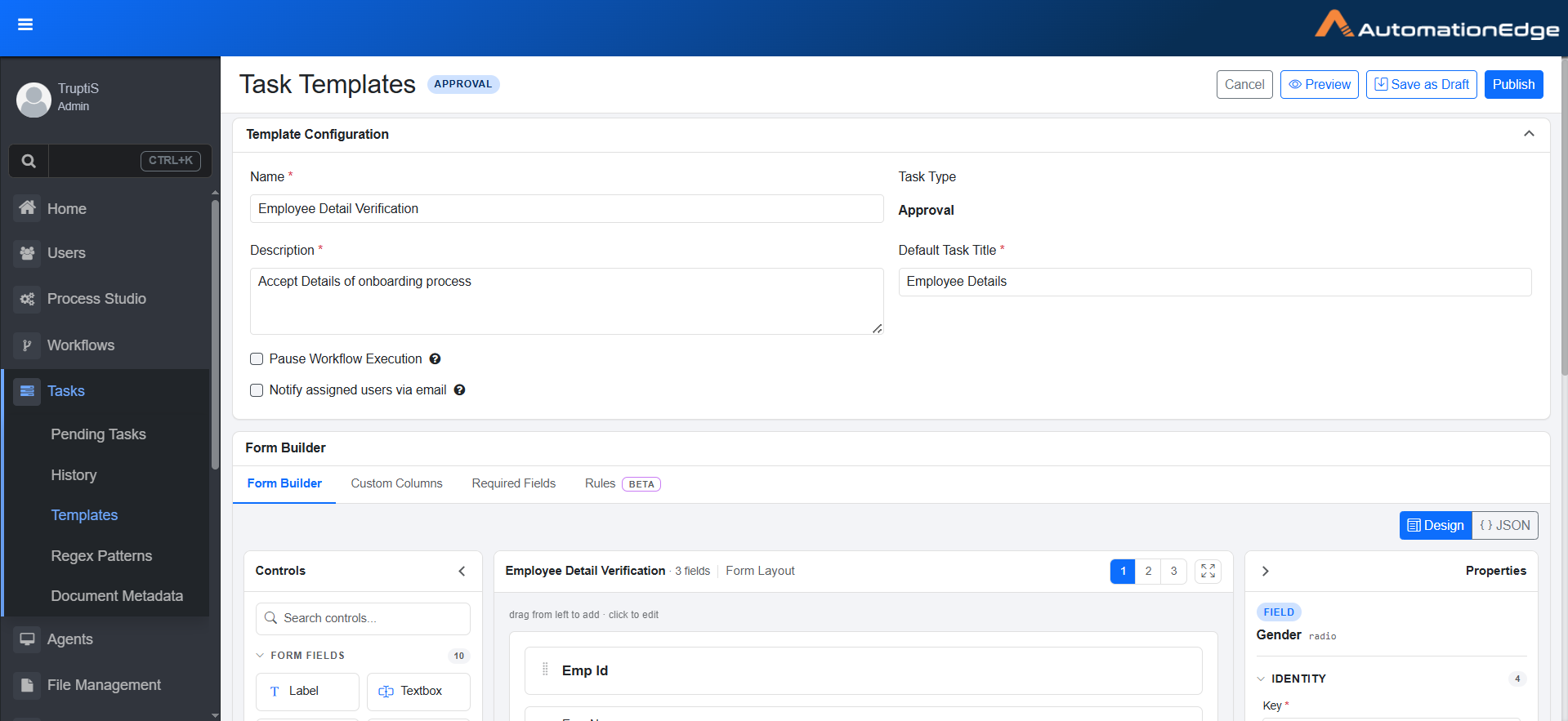
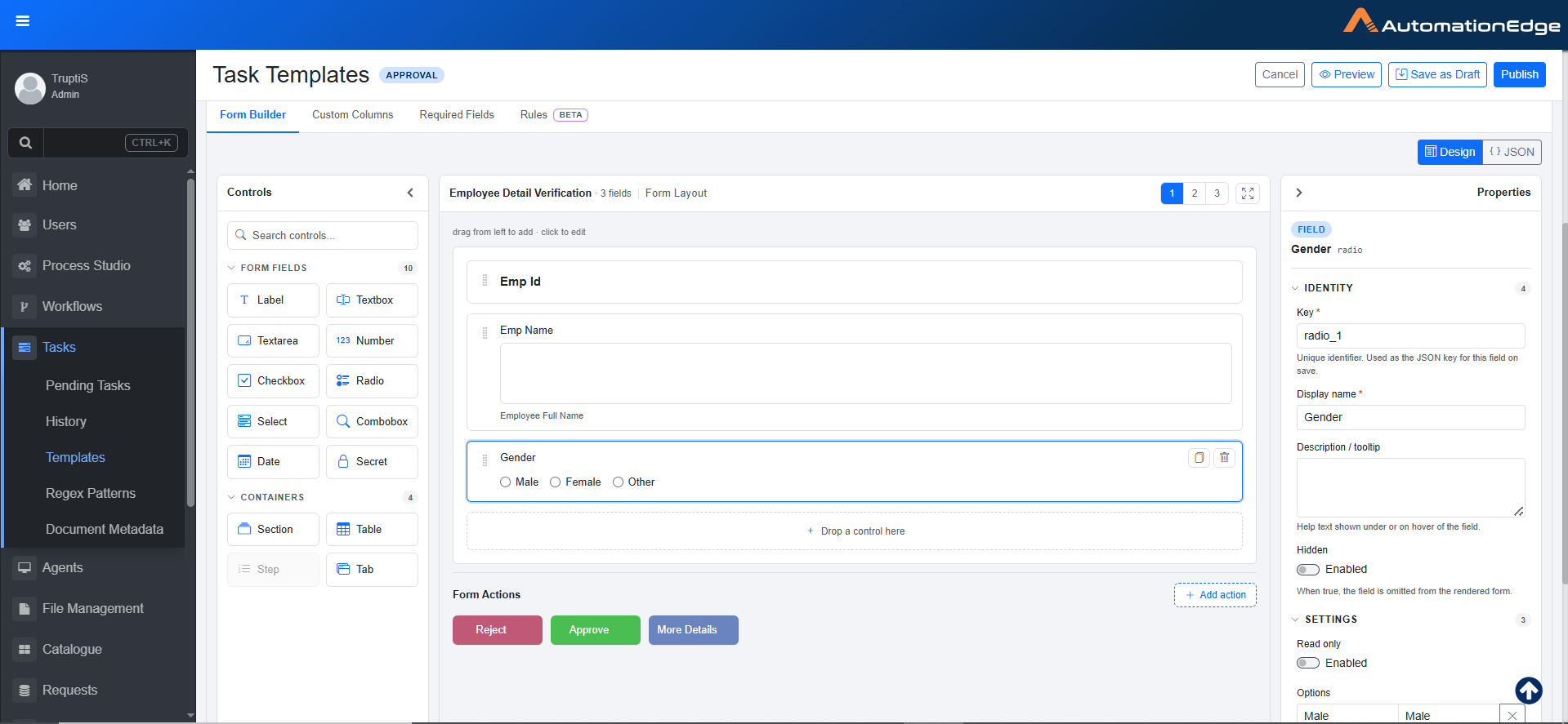
Task Templates details view
-
Enter the following field details:
Field name Description Name Enter the unique task template name (2–100 characters). Description Enter a brief description of what the task is for (up to 500 characters). Task Type When you select the Approval type, the Approval option is set by default. Read-only field. Default Task Title Enter the default title that will be automatically assigned to new tasks. This title is replaced by the title specified in the Human in the Loop step and is displayed in the Pending Task details. Pause Workflow Execution Select to pause the workflow until this task is completed by the user. Notify assigned users via email Select this to send email notification to the nominated user whenever a new pending task is created. Enable Comment Select this to show a comment box on the task, so reviewers can add a note when they complete it.
Form Builder
The Form Builder is where an Approval template takes shape. It's organized into a few working areas wrapped in a top action bar. Getting familiar with these regions first makes every later instruction easier to follow.
| Region | Where | What it does |
|---|---|---|
Action bar  | Top right | Save or preview the template: Cancel, Preview, Save as Draft, and Publish. |
Builder tabs  | Below the template configuration | Switch between Form Builder, Custom Columns, Required Fields, and Rules (Beta). |
Design / JSON toggle  | Top right of canvas | Flip between the visual Design view and the raw JSON definition of the form. |
Control panel  | Left | The palette of fields and containers you drag onto the form. |
Canvas  | Center | The live form layout where you place, arrange, and select controls. |
Properties panel  | Right | Settings for whatever element is currently selected. The panel changes with the selection. |
The Properties panel is context sensitive. For example, click a textbox and you see textbox settings; click an action button and you see button settings (covered later in this guide). If the panel looks empty, nothing is selected — click an element on the canvas to bring its settings back.
Control panel
Everything you place on a form comes from the Controls panel on the left. Drag a control onto the canvas to add it, then click it to edit its properties. You can hover a tile to see its tooltip. Use the search box at the top of the panel to filter a long list quickly.
Form Fields
Form fields capture information from the user.
| Control | What it does | Example |
|---|---|---|
| Label | Displays static text or instructions. It does not collect input. | A heading such as "Requester details" above a group of fields. |
| Textbox | Captures short, single-line text. | Employee name or purchase-order number. |
| Textarea | Captures longer, multi-line text. | Justification or reviewer comments. |
| Number | Captures a numeric value only. | Requested amount or quantity. |
| Checkbox | Captures a single yes/no choice. | "I confirm the budget is available." |
| Radio | Lets the user pick one option from a small, visible set. | Priority: Low / Medium / High. |
| Select | Lets the user pick one option from a dropdown list. | Department or cost center. |
| Combobox | A searchable dropdown for longer lists. | Choosing a vendor from hundreds of records. |
| Date | Captures a calendar date. Select from the Date Format given in settings. | Required-by date or invoice date. |
Containers
Containers do not capture data themselves. They organize and group the fields placed inside them so a long form stays readable.
| Control | What it does | Example |
|---|---|---|
| Section | Groups related fields under a single heading. | A "Shipping address" section holding several address fields. |
| Table | Repeats a set of fields across multiple rows. Note: If multiple rows are added you can change the row size so that all rows are visible.  | A line-items grid where each row has an item, quantity, and price. |
| Step | Breaks a long form into ordered stages the user completes in sequence. | Step 1: Details → Step 2: Review → Step 3: Confirm. |
| Tab | Splits fields across tabbed views within the same form. | Separate "Summary" and "Attachments" tabs. |
Action
Actions add interactive behavior to a form beyond capturing input.
| Control | What it does | Example |
|---|---|---|
| Data Fetch | A button that runs a data source query and returns its results into the form. | Pull a customer's saved details from the database once their ID is entered, so the user doesn't retype them |
Once you drop a Step, the form becomes a multi-step wizard and fields go inside the active step. Likewise, dropping a Tab turns the form into a tabbed layout. Decide the overall shape early.
Form Layout
The Form Layout is the central working area of the Form Builder — the canvas where your form actually takes shape. Everything you drag from the Controls panel lands here, and clicking any element selects it so you can edit its settings in the Properties panel on the right.
To build a form:
Follow these steps to create a form from an empty template.
-
Add a control. Drag a field or container from the Controls panel onto the canvas, or onto the "Drop a control here" zone.
-
Edit it. Click the control on the canvas. Its settings open in the Properties panel on the right.
-
Arrange the layout. Drag controls to reorder them.
Note Select the tabs to get different form layout.
Click
 to expand the form builder to a wider editing area. Great for templates with many fields.
 -
Add form actions. Under Form Actions, click
 to create a button such as Approve or Reject, then configure it in the Properties panel.
 -
Preview and publish. Click
 to see the user's view. Use
  to keep working or
  to make the template live.Note
Save as Draft often. A draft is not visible to business users, so you can refine the form across several sessions before you publish.
Form Actions
Action buttons are in the Form Actions row below the form. Each button does two jobs when a user clicks it: it sets the task's status, and it can trigger a workflow. Select a button to open its properties, grouped into Identity and Behavior. See Action Buttons for the full list of button settings.
Field properties
When you select a field on the canvas, the Properties panel on the right shows its settings. The panel tells you what you're editing: a FIELD badge, the field's display name, and the underlying control type (for example, combobox). Below that, the settings are organized into three collapsible groups — Identity, Settings, and Validation
As the Properties panel adapts to the selected control, the groups below describe the full range of properties you may encounter. Not every property appears for every field — the panel only shows the ones that apply to the control you're editing.
Identity
Identity establishes what the field is. In Identity you give the field its name, the label users see, and any help text that explains the filed. Identity is the basics that make the field recognizable both to the person filling out the form and to the user that read its value afterward. Start here whenever you add a new field.
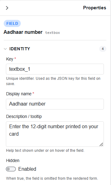
Properties of textbox → Identity
| Property | Description | Example |
|---|---|---|
| Universal (every field) | ||
| Key* | Unique identifier for the field. Used as the JSON key when the form is saved, so automations can read the value back. | textbox_1 |
| Display name* | The label the user sees above the field on the form. | Aadhaar number |
| Description / tooltip | Help text shown under the field or on hover. Use it to guide the user without cluttering the form. | "Enter the 12-digit number printed on your card." |
| Hidden | When enabled, the field is removed from the rendered form. Useful for values an automation need but the user shouldn't see. | Hide an internal reference ID. |
Settings
Settings controls how the field behaves and appears. Once a field exists, this group shapes the experience around it: what it shows before the user types, whether it arrives pre-filled, how much space it takes on the form, and — for choice fields — the list of options people can pick from. Reach for this group when you're tuning the field for real-world use rather than just defining it.
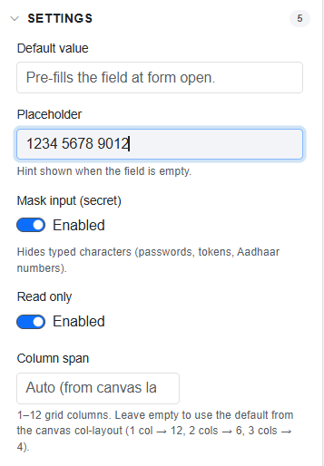
Properties of textbox → Settings
Depending on the control, you may see:
- Default value — pre-fills the field when the form opens (textbox, textarea, number, combobox, date).
- Placeholder — hint text shown while the field is empty.
- Text / Heading style / Text color / Alignment — for a Label: the text plus its heading level, color, and alignment.
- Read only — the user can see the value but not change it.
- Mask input (secret) — hides typed characters.
- Date format — choose how a date is displayed.
- Options — the list editor for radio / select / combobox.
- Column span — 1–12 grid columns; leave blank to use the canvas column layout.
- Section: Collapsible header, Collapsed by default.
- Step: Next button label (default "Continue"), Back button label (default "Back").
Validation
Validation decides what counts as a valid entry. These rules guard the quality of the data before the form can be submitted, catching values that are too short, too long, or in the wrong format. Use this group wherever a wrong value would cause problems downstream. For example, an Aadhaar number that isn't twelve digits.
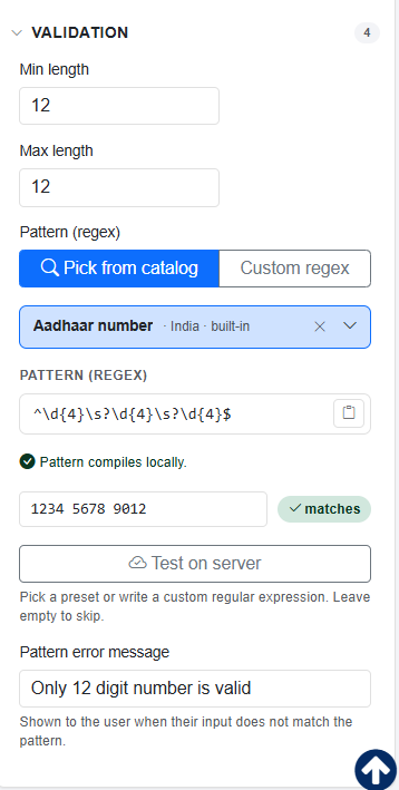
Properties → Validation
Settings — appears on
| Property | Appears on |
|---|---|
| Text, Heading style, Text color, Alignment | Label only |
| Default value | Textbox, Textarea, Number, Date, Combobox* |
| Placeholder | Textbox, Textarea, Number, Combobox* |
| Mask input (secret) | Textbox, Textarea, Secret |
| Options | Radio, Select, Combobox* |
| Date format | Date only |
| Read only | All except Label |
| Column span | All except Label |
Validation — appears on
| Property | Appears on |
|---|---|
| Min length / Max length | Textbox, Textarea, Secret, Combobox* |
| Pattern (regex) + error message | Textbox, Textarea, Secret |
| Minimum value / Maximum value | Number |
| Minimum date / Maximum date | Date |
Custom Columns
Custom Columns allow you to see and search for specific business information (like a "Customer Name" or "Order ID") directly in your Pending Tasks table.
When you filter for a specific template, these columns populate in the Advanced Search menu, allowing for faster efficient task sorting and filtering of tasks.
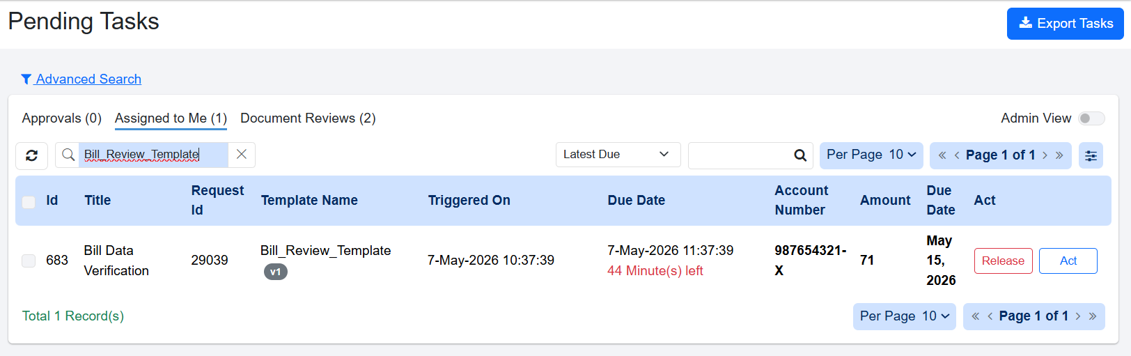
Custom Columns visible on Pending Task after template search
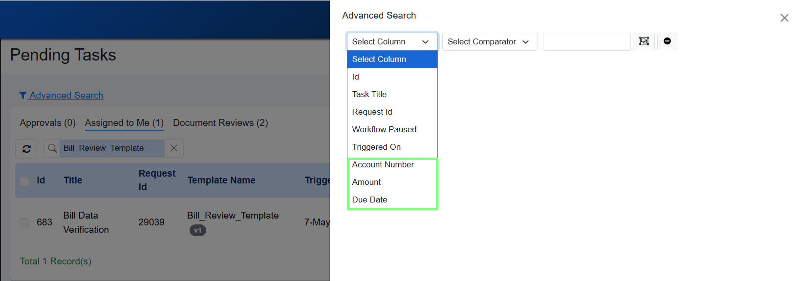
Custom Columns available in Advanced Search
How They Work
These columns only show up on Pending Tasks page when you filter the table by a specific task template.
The data is populated from the variables or values given in the HITL step in Process studio.
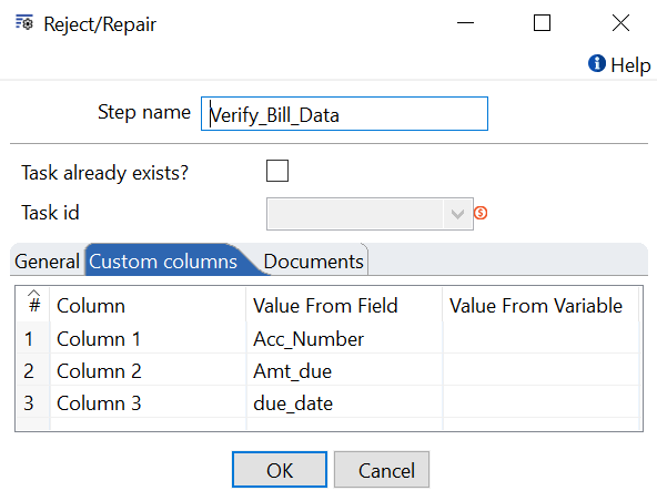
Values given for Column in Reject/Repair step
The Rules
You can add up to 6 custom columns for each template.
Column names must be between 1 and 60 characters long. Every column name within a single template must be unique.
If a column is left blank, it won't show up in the table or the search results.
If you rename a column, the change happens immediately. You don't need to restart the system or wait for a new software update.
Keep the following points in mind before renaming a column:
- The new name is applied everywhere, including past tasks. The system identifies columns by their position, not by their name. After you rename a column, all tasks that use the template display the new label, including previously completed tasks.
- Your data is not changed. Renaming a column updates only the label. Existing values in the column remain unchanged.
- Saved filters and searches continue to work. Filters and searches use the column position instead of the column name. No updates are required after renaming.
- The system does not keep the previous column name. Rename history is not stored. Audit entries that referenced the previous name are not updated automatically. If the previous name is required for compliance or tracking purposes, record it before renaming the column.
- External integrations might require updates. Third-party systems, reports, or scripts that reference the column by name display the updated label after the rename. Inform integration owners before renaming a column used in external integrations.
- Previously exported files are not updated. Files exported before the rename continue to display the previous column name. Export the file again to include the updated label.
For Example,
If you want to see a person's Name whenever you search for a specific template:
Add "Name" as a Custom Column for that template.
The data for this column is set up during the HITL (Human-in-the-loop) step in the Process Studio. For instructions on how to set this up, please refer to the Standard Plugin Guide.
Required Fields
The Required Fields tab shows a read-only grid. Each row is a field, and each column is an action button. A tick means that field is required before that button can be used.
The grid pulls this information from two places: each button's Required at submit setting and any rules you've written. It's a quick way to check your required-field setup at a glance.
If rules are defined and action rules are defined then action rule has more priority than Rules.
Rules (Beta)
The Rules tab lets you add conditional behaviour without code — for example, make a field required when another is filled, hide a field unless a flag is set, or force a value when a button is clicked. Each rule has three parts:
- Name & Enabled toggle, plus Bind to button — apply the rule always ("Always (no button binding)") or only for a specific button.
- WHEN — one or more conditions (field → operator → value). Operators include equals, does not equal, greater/less than (or equal), contains, starts/ends with, matches regex, is empty, is not empty. With two or more conditions you choose match ALL (and) or ANY (or).
- THEN — one or more effects: Require, Optional, Show, Hide, Enable, Disable, Set Value, Set Style. Set Value supports a literal or a formula (add/subtract/multiply/divide/round); Set Style sets background / text / border colours.
Action Buttons
Action buttons define the options that users can select while performing a task. These buttons control how the task proceeds based on the user's choice. For example, you can configure action buttons such as Approve, Reject, or Send for Review.

Add Action buttons
To add action button:
-
In Form Actions section, click Add Action. Details to Add Actions appear.
-
Enter the following field details:
Field name Description Identity Button Id Enter the button id. Label Enter the label that you want to display on the button. Tooltip Enter a short message that appears when you hover over a button to explain its purpose. Appearance Background Color Select a color for the button. Text Color Select a color for text on the button. Behavior Status set on click * Enter the status that will appear on the Task History tab after the task is completed. Workflow Select the workflow that should be triggered when the button is selected. You can also search for the workflow. For more details, see Target Workflow section. Workflow Runtime parameter Select the runtime parameter defined in the target workflow. You can also search for the parameter. For more details, see Workflow Runtime Parameter section. Validation Validation mode Select from All required fields or Specific fields or None. All required fields — The user must complete every field marked required on the form before this button works. Specific fields — Only the fields you choose (in Required at submit) must be filled for this button. None — No fields are enforced. The user can click the button even with empty fields. Required at submit In "Specific fields" mode, the Required at submit picker chooses which fields must be filled when this button is clicked.
Target Workflow
A target workflow is another workflow that is invoked from the current source workflow. You can use this option when the approval process requires multiple steps, such as a Maker-Checker scenario. The source workflow handles the initial processing. When the user clicks a specific action button, the target workflow is triggered. The target workflow performs additional processing based on the data from the source workflow and then decides.
Ensure that the target workflow in the template action has only one mandatory runtime parameter. If there are other parameters, those parameters should be optional.
Workflow Runtime Parameter
To pass information from the source workflow to the target workflow:
- In the Approval Task Template, define a runtime parameter for the action.
- Map this runtime parameter to the target workflow. This parameter acts as an input container for the source workflow's metadata.
- The source workflow passes the metadata as a JSON object into this runtime parameter.
Add Document Review template
To create document review template:
-
In the menu, click Tasks → Templates. The Task Templates page appears.
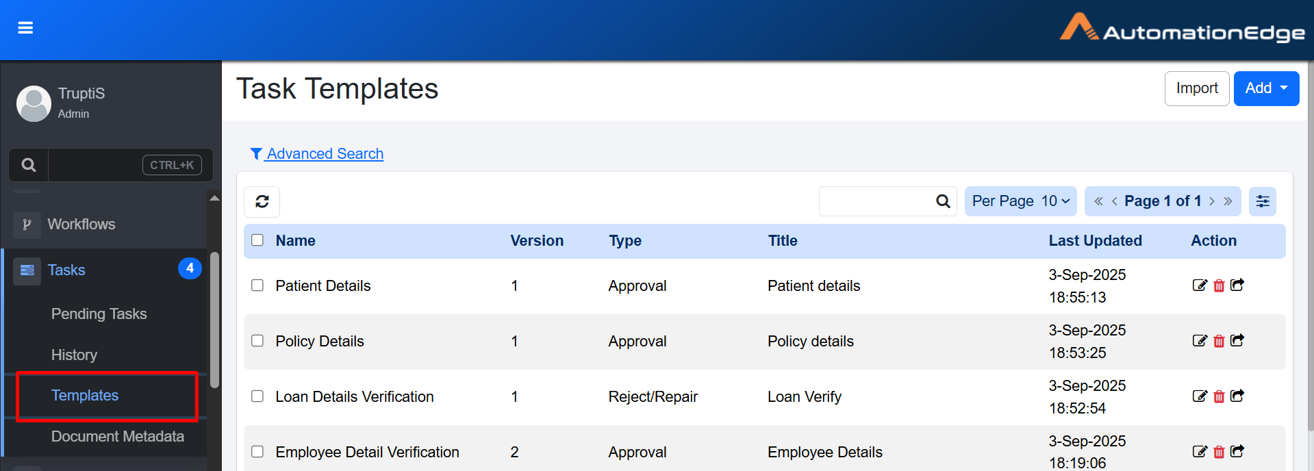
Task Templates page
-
Click Add. A list of task template types appears.
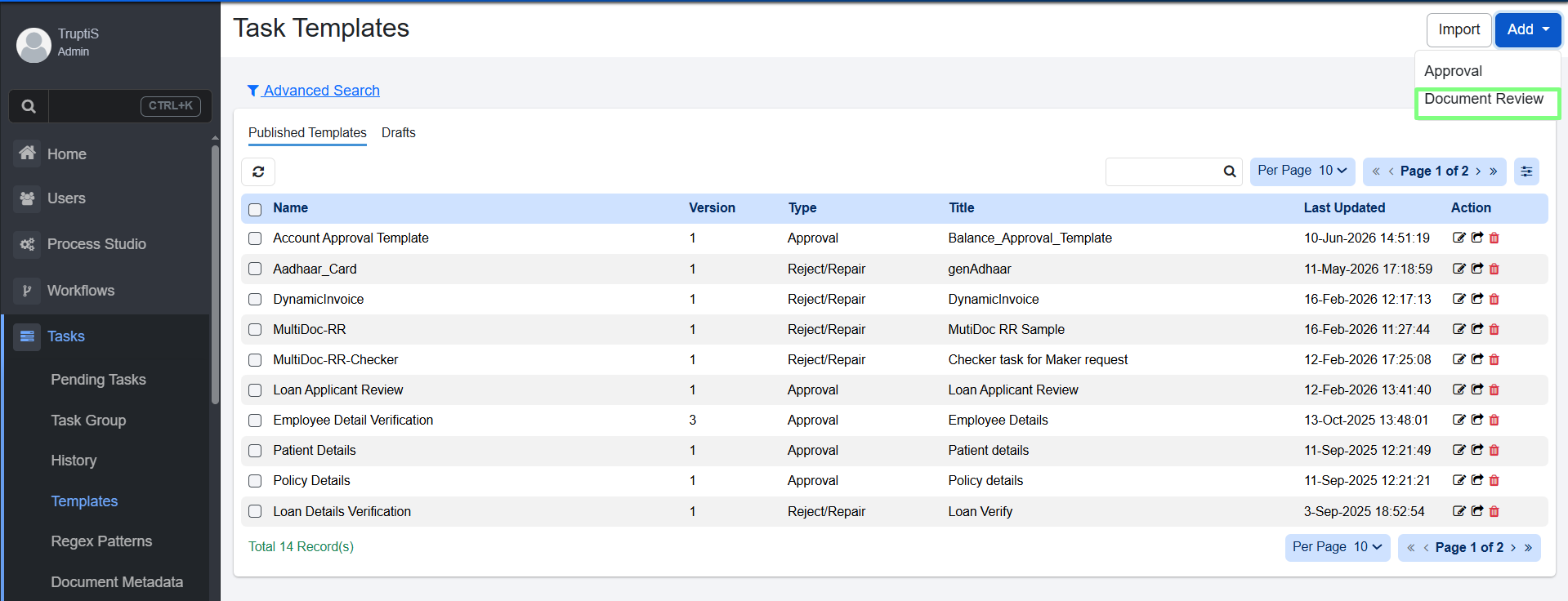
Task Templates: Document Review page
-
Select Document Review. Add Document Metadata dialog appears.
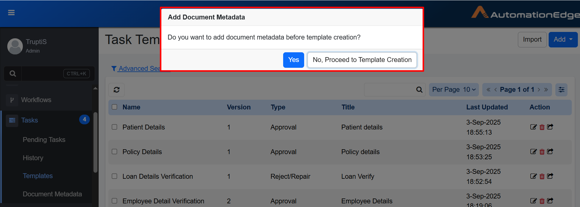
Add Document Metadata
-
In the dialog, do one of the following:
- Click Yes. If Document Metadata has not been created, you are redirected to the Document Metadata tab. For details, see the Document Metadata section. OR
- Click No, Proceed to Template Creation. If Document Metadata is already created, the Task Templates page appears.
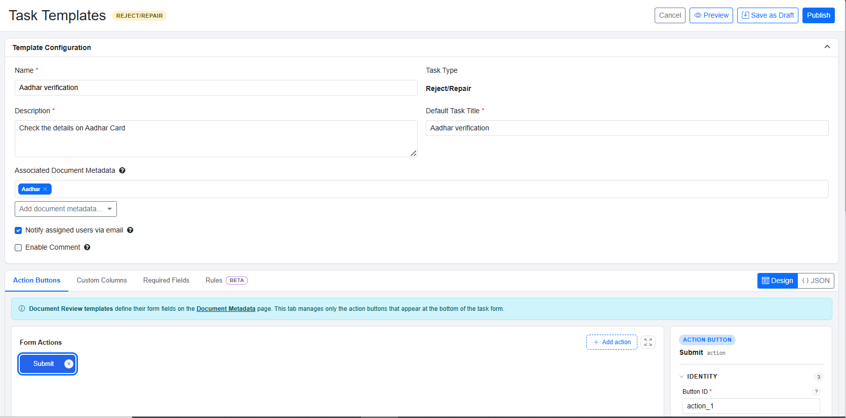
Task Templates details
-
Enter the following field details:
Field name Description Name Enter the unique task name Description Enter the task description. Task Type Task type is selected Reject/Repair by default. Default Task Title Enter the default title that will be automatically assigned to new tasks. This title is replaced by the title specified in the Human in the Loop step and is displayed in the Pending Task details. Associated Document Metadata Select from the list the document metadata whose fields will be required while submitting the template. 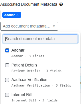
Notify Assigned user via email Select to send email notification to the nominated user whenever a new pending task is created. Enable Comment Select to enable reviewers comment on the task created. Add Action Buttons Click Add Actions to add action buttons. Refer Add Action Buttons. -
Click Publish. Template is created.
Add Action Buttons
Action buttons define the options that users can select while performing a task. These buttons control how the task proceeds based on the user's choice. For example, you can configure action buttons such as Submit, send OTP, Verify and so on.
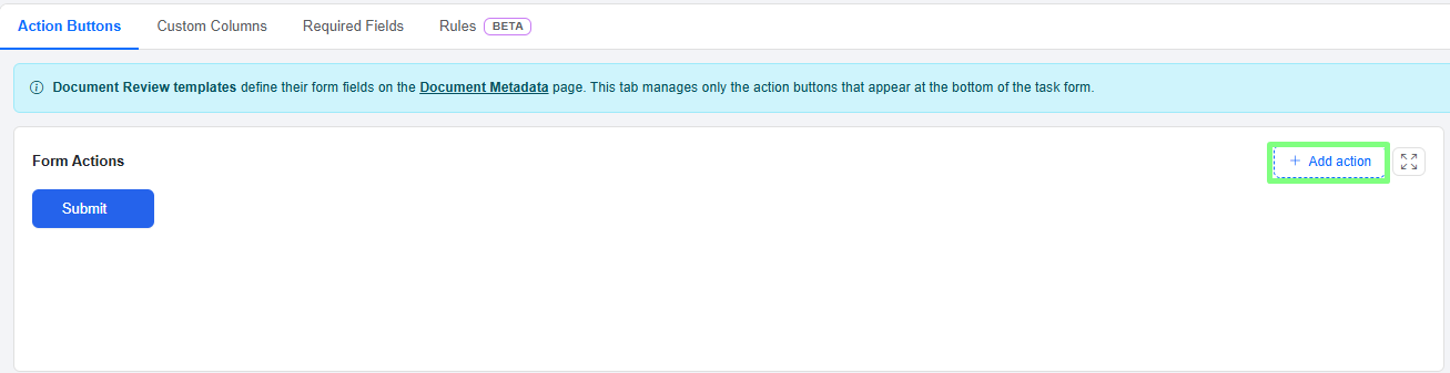
Add Actions
To add action button:
-
In the Add Action Buttons section, click Add Actions. The fields to add the details appear.
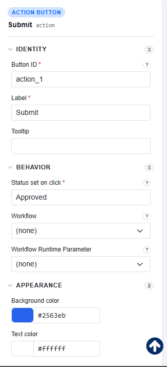
Add Action Buttons
-
Enter the following field details:
Field name Description Identity Button Id Enter the unique button id. Label Enter the label that you want to display on the button. Tooltip Enter a short message that appears when you hover over a button to explain its purpose. Appearance Background Color Select a color for the button. Text Color Select a color for text on the button. Behavior Status set on click * Enter the status that will appear on the Task History tab after the task is completed. Workflow Select the workflow that should be triggered when the button is selected. Workflow Runtime parameter Select the runtime parameter defined in the target workflow. Validation Validation mode Select from All required fields or Specific fields or None. All required fields — The user must complete every field marked required on the form before this button works. Specific fields — Only the fields you choose (in Required at submit) must be filled for this button. None — No fields are enforced. The user can click the button even with empty fields.
Click to understand the details of validation mode.
Required at submit In "Specific fields" mode, the Required at submit picker chooses which fields must be filled when this button is clicked.